Delivering clarity from complexity Coronavirus data
Brightblue has been monitoring the current coronavirus crisis from various sources to present them back as clear and honestly as we can. We have presented them in a clear and easy to read way and giving guidance on what the numbers actually mean (e.g. change over time, inter-country comparisons, attention drawn to misleading information).
How many people are infected?
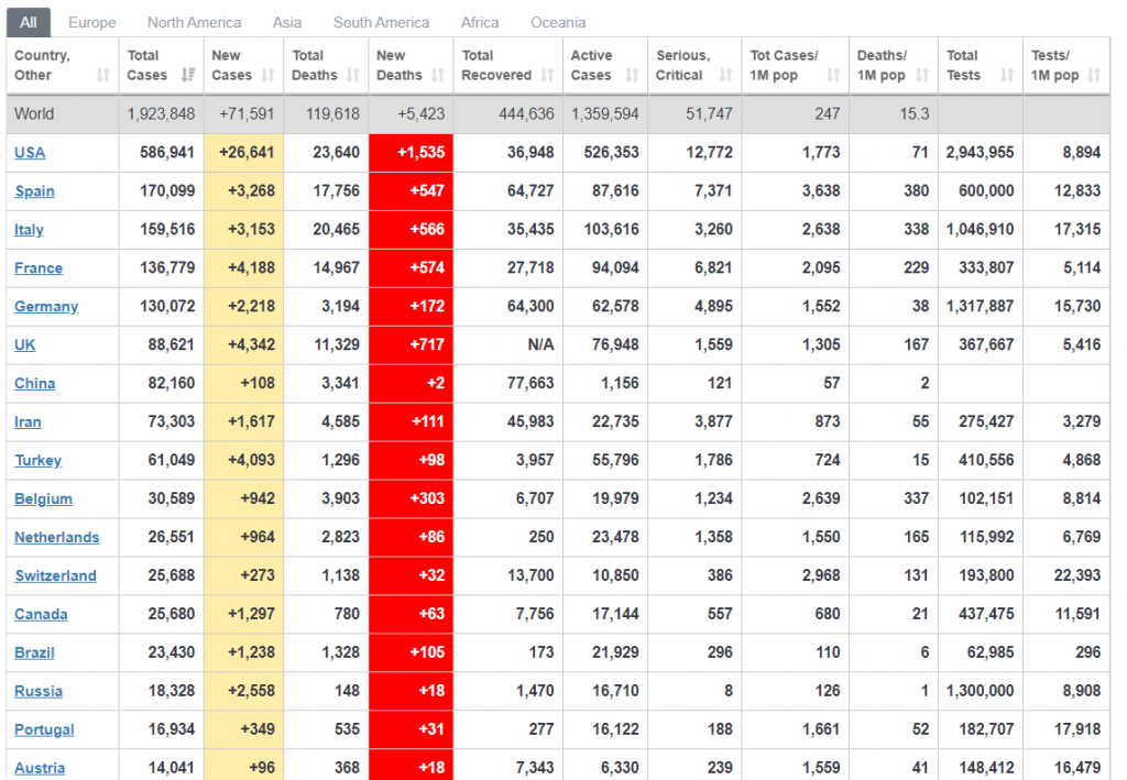
There is a lot uncertainty about the number of cases of Coronavirus in the UK, officially the number currently stands at almost 90,000, which seems relatively low compared to fellow Europeans, Germany and Italy.
Number being tested is low
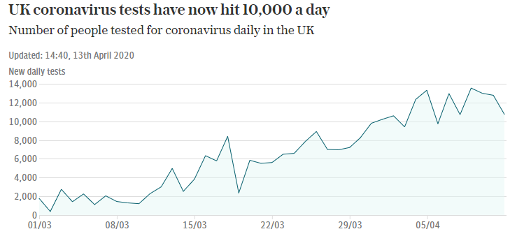
However, the concern on the 90,000 come primarily from the number of people being tested is only around 10,000 per day – this is rising but at that rate it would take 18 years for the whole UK to be tested.
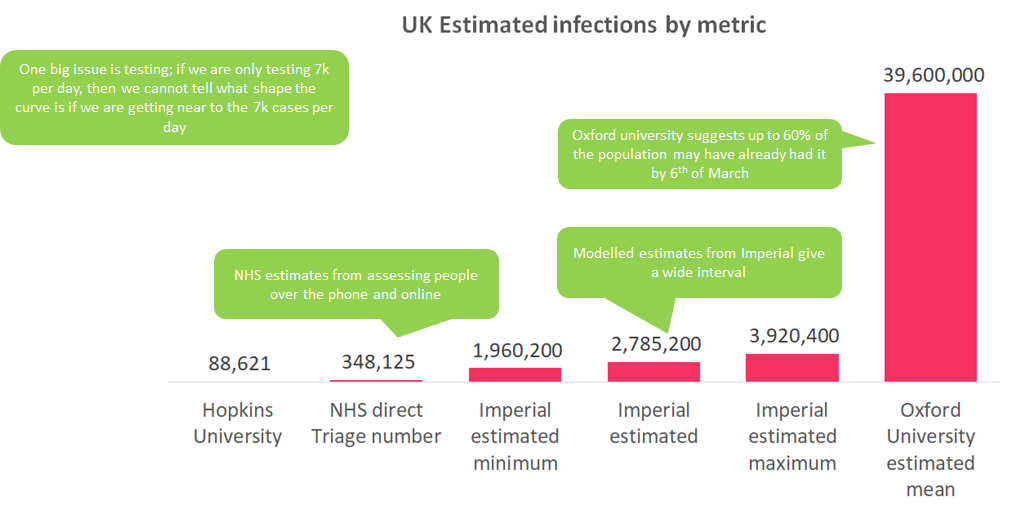
Further to this, data from this NHS site show that 310k show symptoms over the phone suggesting many more may have the virus.
Modelled estimates show a huge range
Even this number may be an undercount as it has been reported that many people have very mild symptoms or none at all. This is where modelling comes in when trying to estimate the number of people who have the virus. Imperial college London published a report estimating the number of victims to be 1.5m, 5 times higher than the NHS direct numbers.
The total number of covid-19 infections ranges from the tens of thousands to the millions – even Oxford university put out a study placing the number at 60% of the UK – which appears to be an outlier.
We just don’t know the absolutes
In truth it’s very hard to say exactly how many people have actually been infected, and therefore very difficult to calculate absolutes. But what we can do is to look at the shape of the data to inform when we may be coming out of this.
What stage is in the UK in?
Flattening the curve
In early March the UK government announced their strategy to combat the current Coronavirus pandemic by trying to flatten the curve, that is to smooth out the number cases into the future such that the “peak” lasts months not days. In order to know if your strategy is working you need to accurately know the number of infections, otherwise you don’t know the shape of the curve.
Potential flattening for the UK
The below chart from the FT shows the death rate falling significantly for China, starting to fall for Italy and appearing to hit the peak for the UK.
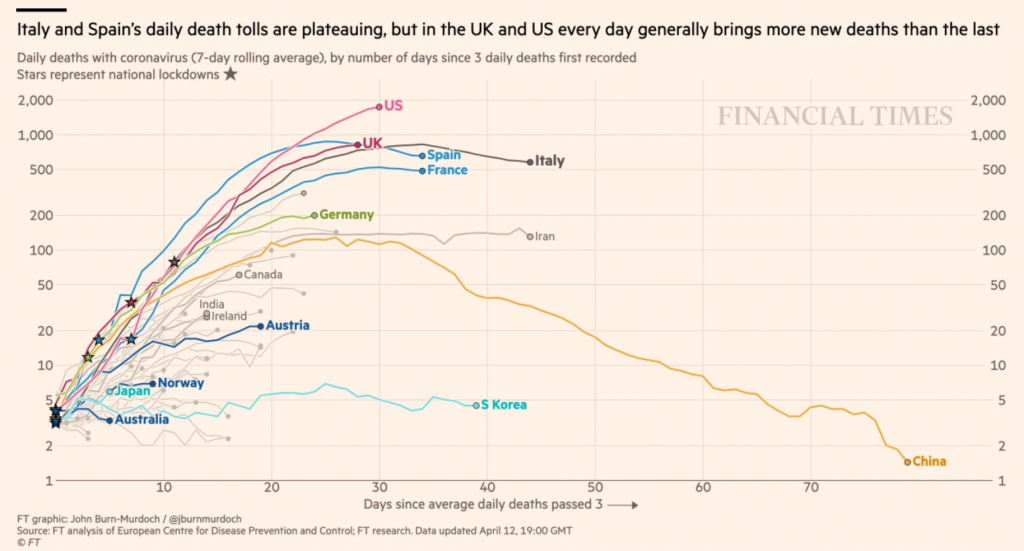
Judging by the Italy / China data, it looks like we are 20 to 30 days away from the death rate being significantly reduced.
Current Economic impact
Expect a sharp fall in GDP
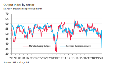
Output data for the UK indicates a similarly bad situation to the financial crisis in 2009. As Output is a good early warning indicator for GDP, we would expect GDP growth to fall to the lows of 2009, c. -1.6%.

Services hit the most
Unlike the previous financial crash of 2009 where manufacturing was significantly hit, it looks like services are much worse hit this time round than manufacturing.
Unemployment on the rise
The UK Composite Employment index has decreased significantly to the lowest point since 2009. Claimant Count is up by nearly 1m people in two weeks, compared with 100,000 usually.

Future Economic Impact
By looking at the countries that are ahead of us on the curve such as China and Italy, we can start to understand what the future economic situation may be.
Martin Sorrell, famous for his predictions of economic shocks, said in PRWeek that he expects it to be a V-shape recovery, so sharp down, but then a sharp recovery back up.
“I think Q2, which starts today, will be terrible. Q3 will be slightly better, but we’ll see a sharp recovery in Q4; brands will let rip. This will be a V-shaped recession.”
Sir Martin Sorrell, PR Week
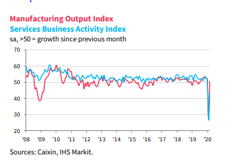
China is recovering
China is seeing a bounce back since lifting some of their restrictions as can be seen by their Output Index recovering. GDP – in dark blue is showing a rebound to normal: if the numbers go above 50 this shows growth since the previous month, i.e. March was better than February. It hasn’t returned all the way to pre-Covid levels, but most of the way.

Services are lagging behind
Although manufacturing has recovered, services are lagging behind.
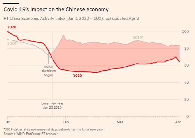
China is c. 20% lower than it should be
The FT has helpfully pulled together some of their metrics – Showing China is operating at 60% compared with the start of 2020, whereas given the 2019 numbers it should be at about 80% – a c. 20%-point gap. However, the gap is narrowing, and as China is an export-based economy they may struggle to recover completely until the world has recovered.
Summary
These are some speculations about what this means – for health, for the country and for the economy. We are guessing we are 20 to 30 days away from the death rate in the UK being significantly diminished. This should mean a loosening of the lockdown, leading to an economic recovery as seen by China which has returned to c. 80% of expected economic activity 3 months after the lockdown imposition. For the UK, this could mean we are in a similar economic position by the end of June.
These are not predictions but some thoughts that we had to make you consider the future and how you can best plan to come out of this.
The Brightblue team have decades of experience helping clients understand media efficiency by truly digging into the drivers of sales and revenue. We have experience across automotive, retail, travel, entertainment, telecoms, FMCG, white goods, financial services, health and many other sectors. Our unique way of modelling the entire client journey truly helps marketeers understand what they can do to shine in their organisation by driving business and making a real difference to their bottom line. Get in touch if you have any questions on this article or any of the ways Brightblue can help.